Readable Text
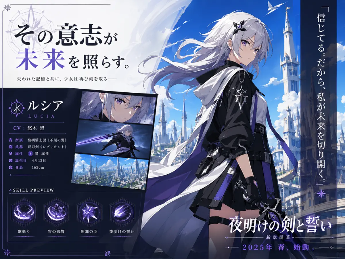
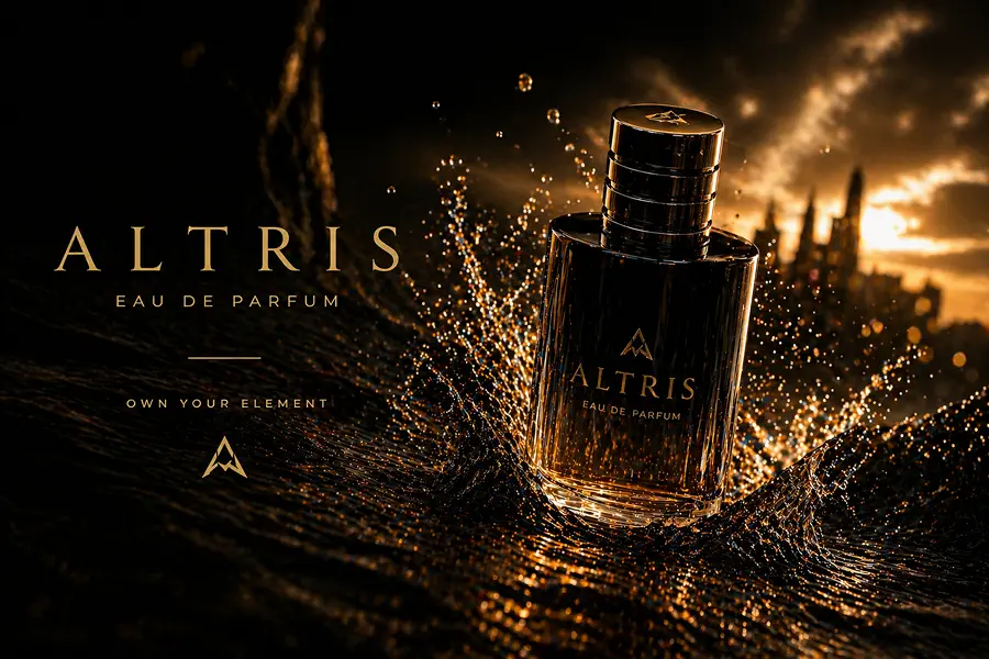
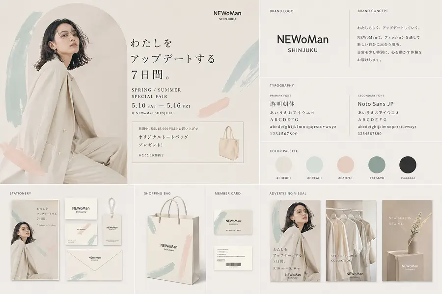
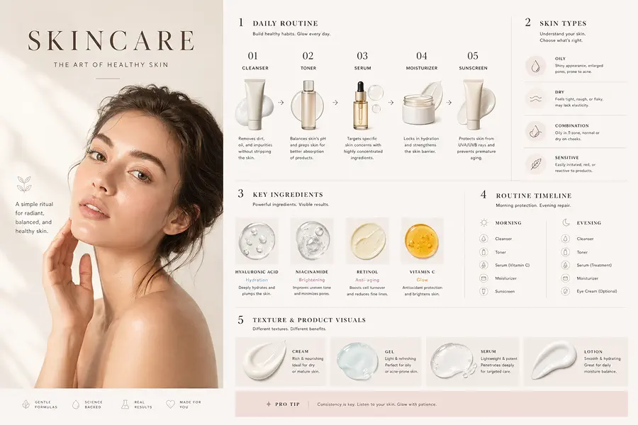
Posters, menus, labels, packaging, and infographics work better when the text stays readable. It is still the clearest reason people look for GPT Image 2, because the image can carry real copy instead of falling apart once words become part of the design.
Cleaner Structure
It holds together better when one image needs several information blocks instead of one subject on one background. That makes it more useful for explainers, layouts, and presentation-style visuals where spacing, grouping, and hierarchy need to stay coherent.
Useful Editing
If you already have an image, GPT Image 2 is useful for changing the background, updating text, cleaning up an area, or making a tighter revision without starting over. That matters most when the first version is close and you want iteration, not a full reset.
Better Output
The result is more often usable for campaigns, mockups, explainers, and internal creative work instead of stopping at rough concept quality. In practice, that means less manual cleanup before the image is ready to present, test, or ship.